• Product
  • Food
  • About
  • Blog
  • Contact
Menu

Dan Jackson Product and Food Photographer

Product and Food Photography
  • Product
  • Food
  • About
  • Blog
  • Contact
×

On location we had an assortment of new textures and bits of furnishings to work with.

A Smooth Day of On Location Product Photography

Daniel Jackson April 2, 2025

Shooting products outside the studio can inject an interesting narrative element into photos. In the studio you can  have a bunch of props and backgrounds but sooner or later you run out of options to make convincing lifestyle shots and you venture out of the studio for inspiration. For this luggage shoot we needed to show the bags being used in a romantic way that suggested a weekend getaway. My friend and colleague Leslie Eugene at Pretty Haute Marketing, came up with the idea and location. She found a very chic airbnb that fit all of our needs. I actually ends up being cost effective when you consider that we got access to several different looks in the small suite. In the studio to make a bedroom set would require all of the props to be brought in, nightstands, linens, beds, chairs a couch. The logistics of getting a hold of all of those items would be cost prohibitive not to mention how much time it would take,

Not a tough look to reproduce in the studio until you consider gathering all of the props.

The suite worked out perfectly. We got a nice group of images and had a very successful shoot.

The privacy glass provided us with a nice minimal framework for our composition.

Simple and minimal, really allows the product to shine.

Overall the location gave great vibes. It really feels like a relaxing weekend out of town.

A Great Partnership

Daniel Jackson March 31, 2023

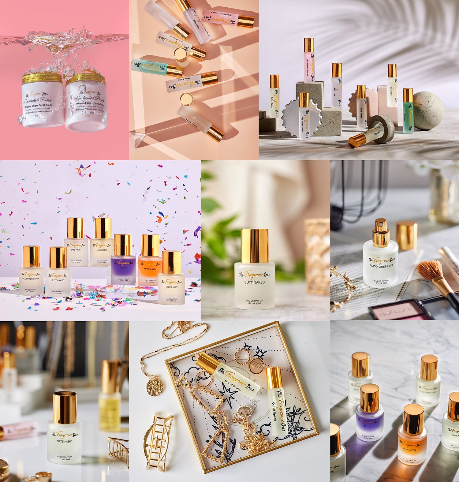
I want to take a moment to highlight some product photos that I am really proud of. Every time I work for this client a really love the results, it comes down to a great client that allows us a lot of freedom and the creative team, in this case myself and Leslie Eugene from Pretty Haute Marketing who provides direction for the campaign and arrives at the studio with tons of props and ideas on how to style stand-out images.


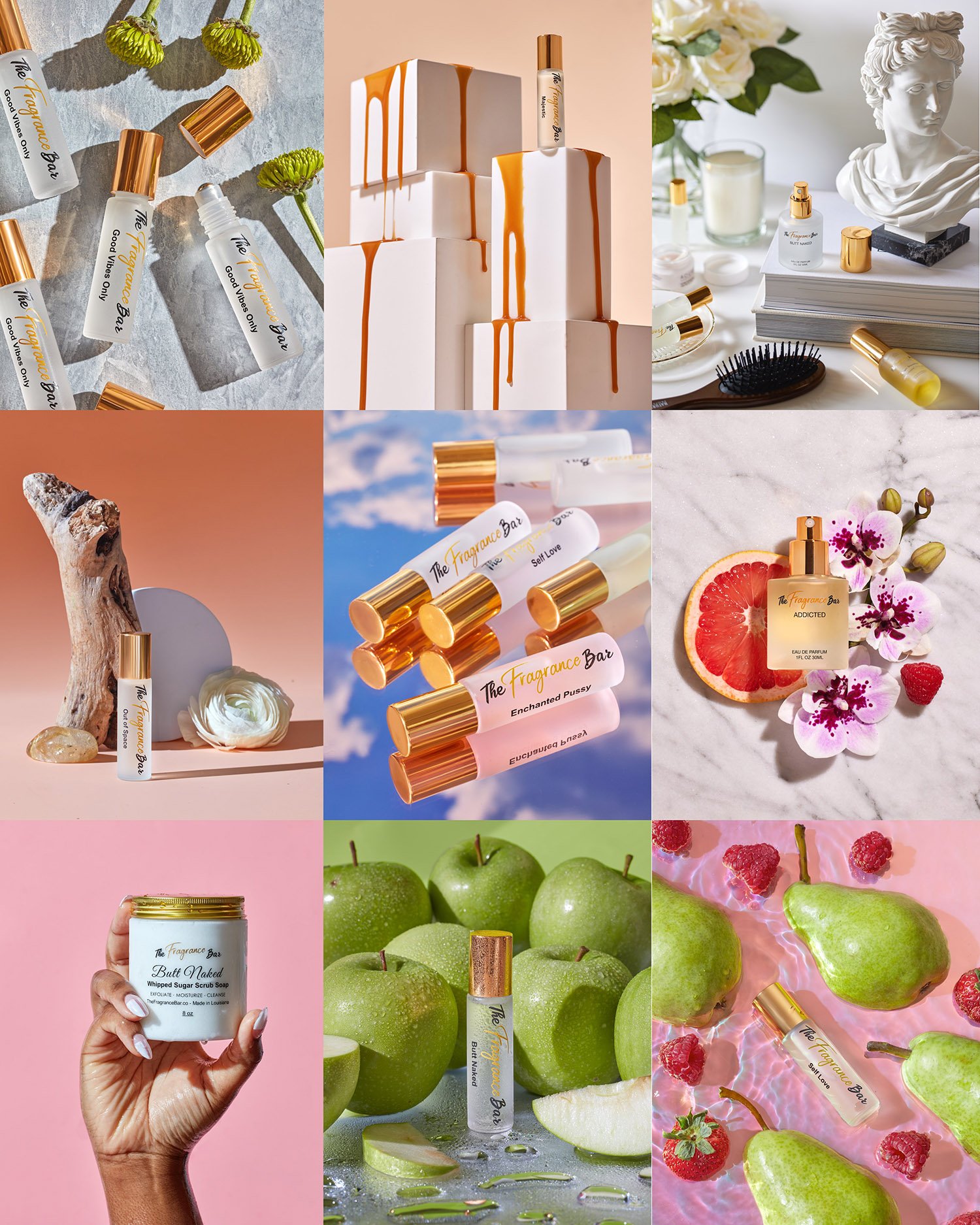
These product images are just a taste of what we have shot for The Fragrance Bar and have all been made in the last few years for social media marketing. Our task was to create impactful, sharable, likable images that highlight the product and grow awareness of the brand. We like to use different aspects of the products as inspiration, we may want to emphasize freshness or might focus on a feeling like clean or crisp. Sometimes we are guided by particular ingredients of the scents or we might just be inspired by the design of the bottle and the way it looks in different lighting.


My studio is filled with my collection of props, textiles, household goods, paper, wood, hand painted backgrounds, tabletops, blocks and anything else I think might help tell a story and grab someones attention in the sea of competing images on social media. We start with an idea of what we want each shot to accomplish and then start “building” our set. As we put the elements together, it doesn’t always work exactly as planned, so we will adjust the camera, lighting or props until it works. Often this will take us in really different directions, where we could never have gotten without being challenged by some aspect of the composition. It can be a struggle to make a picture “sing” and it is important to keep working until something interesting develops.


After I shoot and process the photos many of the images go on to a designer, where text or motion are added, so sometimes we will shoot with this in mind. We will leave blank space or use blur selectively in the photographic process to allow room for the graphic designers work. Cropping and using additional design elements can be a great way to stretch your photographic budget because you can use the images more than once. An image might be used on its own without a graphic and then be used a year later with a mothers day promotion.


I really have a lot of fun going back and looking at my work and seeing how my personal growth in photography is a process of evolution. Little by little I figure out techniques and develop my eye just enough to surprise myself and stay fascinated by creating images.

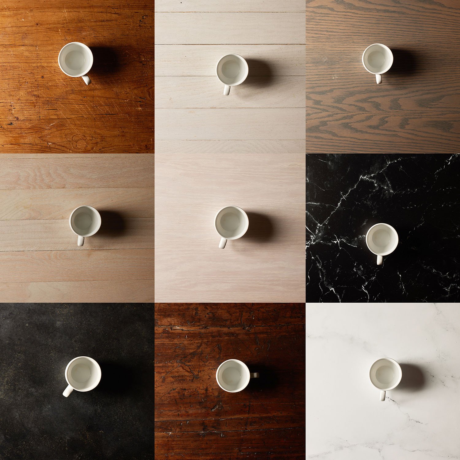
Just a selection of my current background collection, most of these are hand made with paint and plaster, one is wood and the tiles are a simple adhesive faux tile product sold at home centers. Not all backgrounds need to be masterpieces especially if they are used as a background, remember backgrounds are often a little out of focus and can hide a less than perfect surface.

My Background and surface collection for product and food photography

Daniel Jackson January 24, 2023

Backgrounds and surfaces are indispensable for product and food photography. I have been amassing a collection for years now. Finding what I can at yard sales, flea markets and even classifieds but when I can’t find exactly what I am looking for I make my own. I might get some wood and make a tabletop or just paint a piece of Gatorboard, a lightweight but rigid piece of foam. It can be helpful to have a bit of texture in your backgrounds. When I feel like I Ineed texture a coat of plaster can do the trick. Now I have I have a bunch of options but you can really never have too many backgrounds… if storage wasn’t an issue. 

Sometimes I will use the terms background and surface interchangeably but for the most part a surface is the base that the objects will sit on and a background will of course go behind the object like a wall. Where things get confusing is that I mix the up a bit from time to time, A surface might make a good stucco wall or a paper background might go great as a tabletop, sometimes a background will be slung from under the object to the background in what is usually referred to as a sweep in order to create a seamless transition from surface to background.

Storage is a pain! Early in my search for textures I was desperate and would buy a whole table just for the top, it was expensive and took up far too much space. When possible I would unscrew the tabletop from the legs and store it away for when inspiration struck. I still have a zinc covered table and just recently added a marble dining table to my collection. The dining table gets used for photos but serves double or triple duty as an actual dining table and for staging props during shoots.

In my experience with food and product backgrounds I have learned simple is often better. I like surfaces that don’t compete too much with the product or food. If I want to make it a more exciting shot I would rather get creative with lighting or use dramatic shadows.

A few more, mostly wood surfaces. The two bits of marble are computer prints, they can be convincing since marble has no texture, the shadows can be a giveaway when using artificial surfaces with texture, still not my favorite, I usually try and use the real thing.

These shots are just a fraction of what I have and use in my studio, paper sheets and rolls, acrylic mirrors and white and black acrylic sheet play a huge roll in my product and food shots, although I have a slightly different technique for each. Product shots rely on a cleaner and more minimalistic setting. Most brands are very careful about curating what messaging is present in their advertising so usually the product is the main event, everything is calculated to magnify the branding and not detract from their messaging. Food is a little more of a narrative, we might push a feeling by using rustic surfaces or textures that remind us of home or good times.

Backgrounds can inject a little magic into a shot, I will often start shooting a subject and feel it is missing something and then with a quick change of background find that everything falls into place beautifully. It is all about having the appropriate amount of detail to entertain the eye without distracting it.

These textures have authenticity, marble metal and wood always look good. The colors are sheets of color aid and this is just a sample, I have probably 100 of these. Color Aid is super useful, it is silkscreened perfectly matte paint on paper, it has a flawless finish and a richness and intensity of color.

If you have any questions about surfaces and backgrounds send me an email, I would be glad to help. I am passionate about product photography and helping businesses promote their brand, If you are looking for food or product photography in the Philadelphia area and have a project in mind I would love to hear all about it,

Product Photography Assets - How to Make the Most of Them

Daniel Jackson January 28, 2022

I love seeing my clients getting their moneys worth, it keeps them coming back and it warms my heart a little to feel like I am helping them take their business to the next level. One place I see a stark contrast between different clients of mine is how much they use the photos. Some clients will post the images to their website and nothing else, some will post the raw shots to social media and that’s it, but what I find really exciting is the possibility of creating exciting content from simple “shots on white” in a few minutes that can be used over and over.

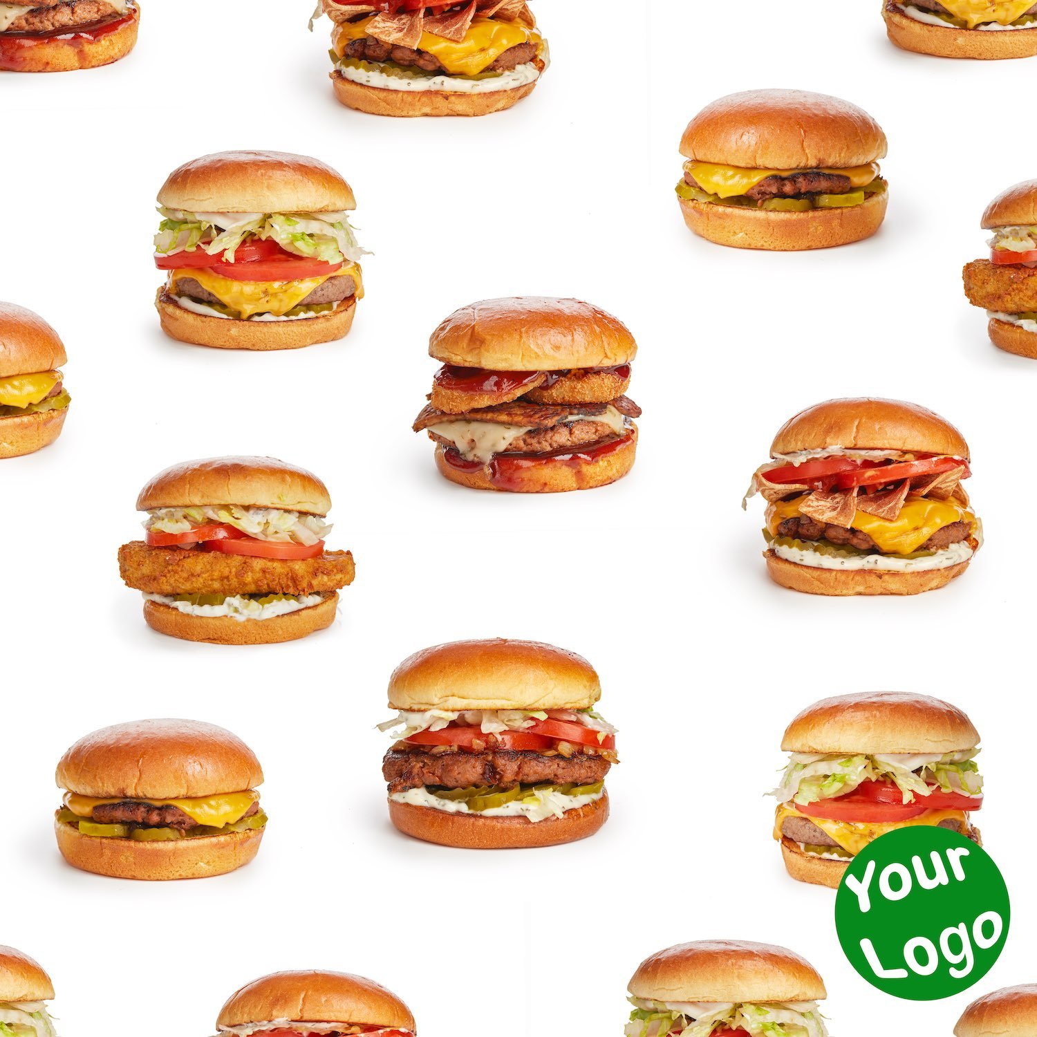
As a demonstration of what can be done I have taken some photos of burgers that I shot for one of my favorite clients, Daily Veg, a vegan restaurant with amazing food. The restaurant does an amazing job of using their imagery and gets a lot of mileage out of their images they use them for an in store menu, for social media in lots of different creative ways and on their website. So this isn’t a tutorial for this client, rather they have inspired me to post this in the hopes that it will help you if you feel like you are not getting much use out of your photos.

The raw material is pretty simple, just the product on a white background photo. While they are awesome for e commerce and selling, If you post these to social media they lack panache. If your budget can afford it, the solution is to shoot lifestyle photos that show the product being used or on a small set in a way that brings life to the product and gets your customers fired up about what you have to offer. But there is a second way, using the images creatively in a collage, by using repeating patterns, adding color and text.

Throughout this post are just a few variations on this idea that make pretty solid social media content. I did these images in photoshop in a few minutes each. While I am very comfortable using Photoshop these are very simple and would be easy for someone with a very basic understanding of the program. If you feel that you aren’t up to the challenge and you are working with a graphic designer then you can give the job to them, it will be money well spent.

In these days of social media, businesses have an amazing amount of control. Rather than spending thousands on a quarter-page of a local magazine, you can reach out to potential clients around the globe. Advertising access to your clients used to mean booking tv time for a commercial, or buying a page in the newspaper or in magazines. But now we can reach a huge audience without the expense of the traditional routes. All you need is content that is engaging and plentiful. Your images make all of the difference, they are what catapult your business in front of people all around the world.

When combined with lifestyle shots, collage images can pad out your feed in a way that is exciting, fun and eye catching. It can also stretch your dollar and keep your product on the top of your clients mind. Just imagine any news or promotion is a great opportunity to add a little text and make another post and keep your followers engaged and informed with your brand. And if you need great product photography you came to the right place.

One of my new backgrounds for lifestyle product shots gives a nice comfortable kitchen feel to my photos.

DIY Product Photography Background Sets

Daniel Jackson January 22, 2022

This last year was a big one for my product photography business. I moved from a few hundred square foot studio to a 1200 square foot studio. Now my workspace has everything I need to make amazing images and functions as a workshop as much as a studio. I have filled it with tools like a table saw, a small painting booth with airbrushes, a full kitchen for food photography, shelves full of props, computers for image capture and retouching. I have stayed busy making product  and lifestyle photography for businesses here in Delaware, in nearby Philadelphia and across the country. On occasion thanks to Instagram, clients will send me products from the other side of the globe to photograph.

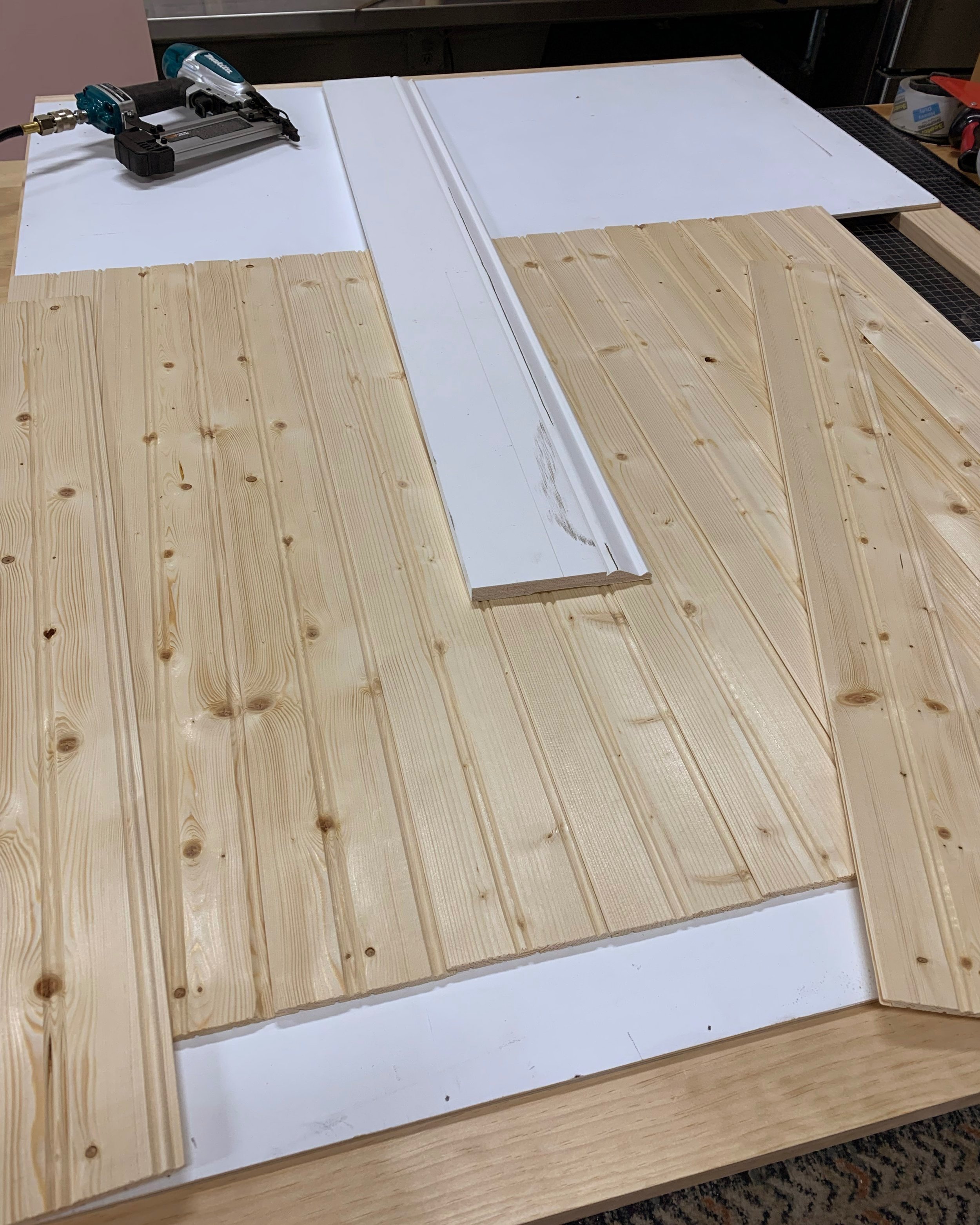
The bead board I ended up choosing, thin but affordable.

I ended up in my dream studio. It took a while to get it all together but it is a functioning and working creative space. Some studios are showrooms because they need to be rented out but this one is different, it is a workshop, as suited for cutting wood, building sets and painting as it is for photographing. For me it is a perfect blend but for all of its functionality it doesn’t make a great background for product photos. I could make the space into a showroom but then I am limited to a single “look”. What I need for my photography is for the studio to function like a chameleon. When I need the set to look like a jungle, no problem, I assemble a few props and viola, we have a jungle. But when that won’t do I need a ton of different backgrounds suitable for all different types of product photography. Ideally I need to go from a colored set to a white set from a kitchen set to a bedroom set in a short time and it needs to look great.

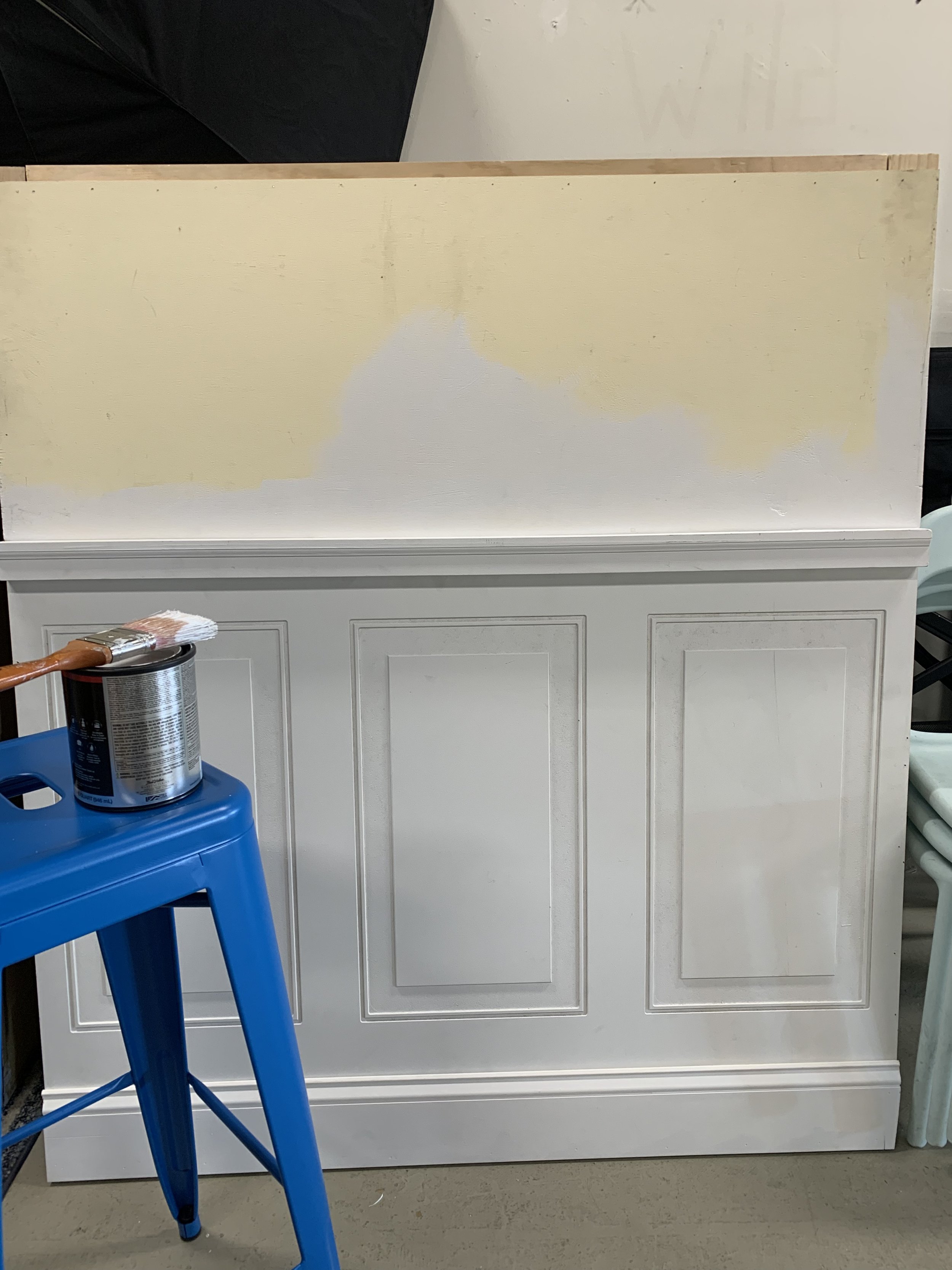
A fresh coat of paint to spruce things up….pun intended.

I stock the studio with rolls of backdrop paper, surfaces and backgrounds of all kinds, and while they are perfect for tons of different products. Sometimes when shooting lifestyle product photography, you need the background to say more and have a different character. I am constantly finding the need to suggest different environments in the home, like kitchens bathrooms and living rooms. It only takes a few simple details to create the illusion of these spaces but a plain or colored background just won’t cut it. So I need a set, and there aren’t set stores around the parts so that means I need to pay someone to make one for me or make it myself. Now you can imagine why my studio is as full of tools for constructing sets as it is for shooting pictures

After some consideration I decided to make some walls with some relief elements, like moulding or trim. I started to think of making theater flats, which are 4x8 foot panels that are joined together, but soon became overwhelmed with the scale of the project. I will loop back around and make some flats soon, but I decided to start at a more reasonable scale and budget. I opted for a more reasonable 40x50” and set my mind on two designs, one of wainscoting and a second design of wood panelling. 

My first move was to go to the Home Depot and get my materials. I had decided to build the panels in much the same way as you would in a house, using real bead board and trim to build up the relief. But while I was looking for moulding and bead board to construct my set pieces I happened to notice that they had inexpensive options of both the wood paneling and the bead board. Smaller thinner options, and while they weren’t as thick and substantial they both looked pretty good at a fraction of the cost. I had spent hours mulling over what materials to use and a quick stop at Home Depot changed my plans for the better in a hot second. I think the lesson here is not to overthink things and jump right in. About $150.00 later I had my materials ready and a real plan on how to get things done.

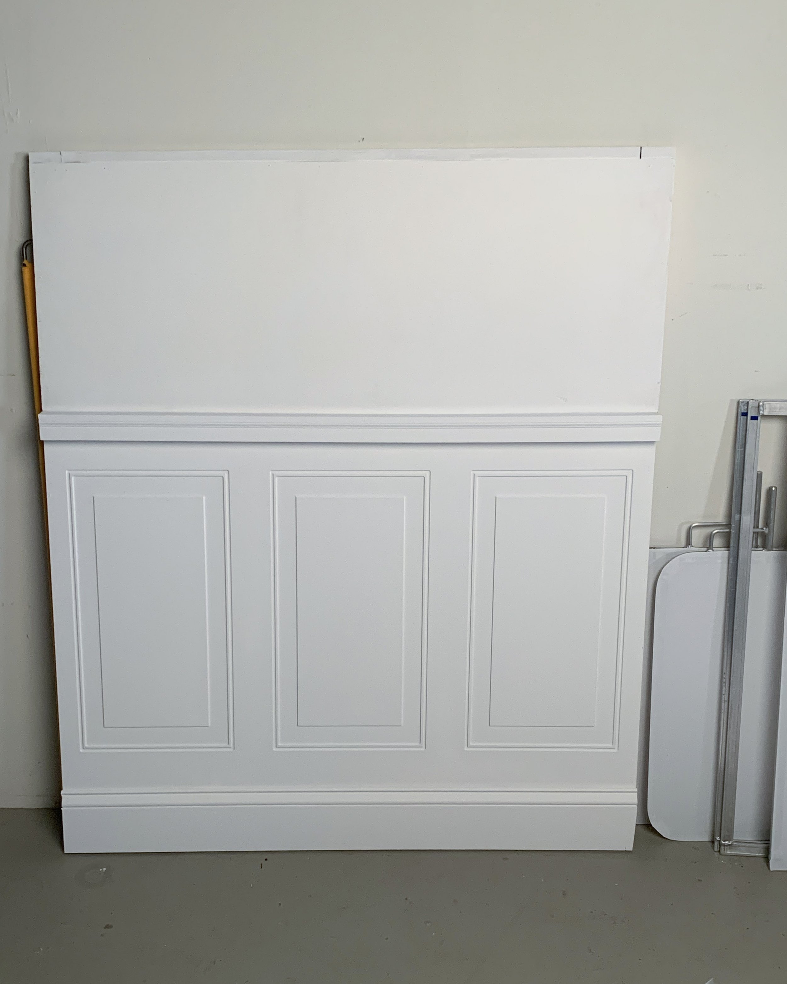
Back at the studio I gathered my wood and started assembling a frame of 1x3” pine. Next, I added a piece of 1/4” plywood to the frame that would act as my wall. Once the smaller thinner bead board was glued and nailed to my support I was able to finish the look with some floor trim and a chair rail. Lastly I added a couple coats of matte white paint. While I think it is common to paint moulding and wainscoting in a glossier finish, matte is less problematic when photographing. Now that I have my two sets constructed I have the option of painting and repainting them for whatever I might need.

it is easy to see how a little color could make things pop.

Both sets turned out well and seem durable. And, I have quickly started to find good projects to use them on. If I decide that a little more high end look, using better materials would help me, then I may revisit and upgrade later. For now what is most important is that rather than a simple flat background I have made something that has depth and dimension and is beautiful when light and shadows play across the surfaces. Now, rather than a shallow set I can place this set far away from my product and really stand out with images that other photographers don’t offer.

Thanks for coming along for the ride, I am really happy with my backgrounds and once I got going they were really easy to construct. I plan on getting a lot of use from these, with a quick coat of paint they can be very versatile. I no doubt will use them for lifestyle product images for years to come. Keep your eye on this page for more product photography related tip and techniques. And if you found me through this post and found it inspiring take a second to say hi or visit my online portfolio.

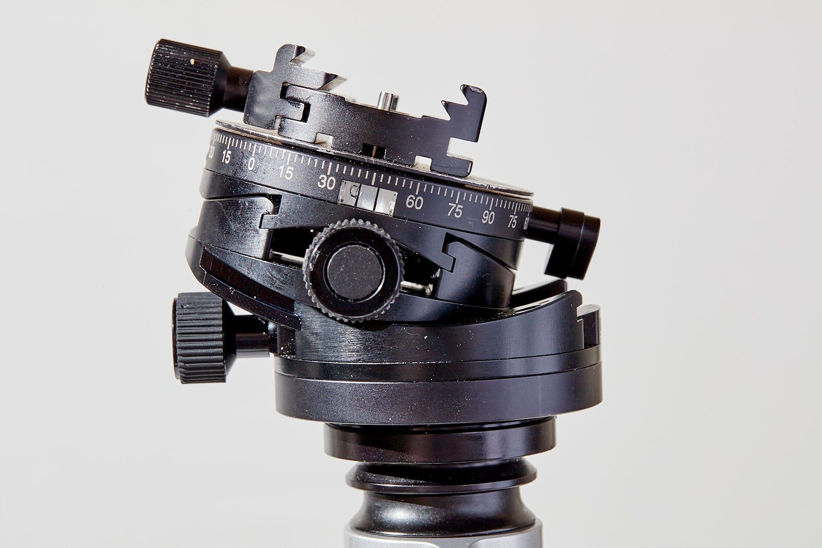
The Arca Swiss C1 Cube. Mine is showing a little wear.

Arca Swiss Cube C1 vs Core 75

Daniel Jackson October 17, 2021

The Arca Swiss C1 geared head is well known by many photographers, perhaps more for its astronomical price tag than its ease of use and rock steady precision. Many photographers have looked on, wondering if it is worth the money but haven’t dared drop the chunk of cash required to get their hands on one. Even counterfeits are wildly expensive. The good news is, Arca decided to make a version with almost all of the functionality and at half the price the Core 75, and the smaller core 60. I have both the 75 and the cube and a good bit of experience with using each model. If you like the precision of a geared head these are amazing, I have tried the Manfrottos and used them for years but these are more solid, don’t get stuck and are compact in relation to the Manfrotto offerings. The fit and finish of these two Arca units are almost identical. It seems like the parts, like knobs and gears are all the same. They are both reassuringly solid.I love them both but there are a few shortcomings when the two are put up against one another. The first and most obvious difference is price the C1 Cube is double the price of the Core 70. So what do you give up for a massive savings like that?


I bought the Cube like many others, to do architectural photography. The precision is perfectly suited to the task. I found that I loved the cube so much that I would bring it to the studio and put it on my studio stand when shooting product photography where precision is equally treasured. Shooting still life is a dream with the C1 Cube. After every shoot I would happily unscrew the head from my studio stand or tripod to bring it to whatever job I was shooting the next day. The problems arose when I would forget the head or when I would put it on too tightly and had a hard time removing it from the tripod. I started to worry about the strain I was putting on the little knob that locks the rotation, every time I tightened it I could imagine snapping it. I was worried enough that I considered getting another, but the price was just too much. That is why I was thrilled when the Core 75 came along.


The smaller Core 75

The smaller Core 75

I ended up buying a Core 75 to bring on my architectural shoots and leaving the cube on my studio stand. I figured any weight I can cut from my location kit is a good thing. And for the most part it has been a good move. The Cube is capable of everything I need it to do in the studio, I do a bunch of flat lays that wouldn’t work on the Core 75. The reason for this is that the cube has a hinge that allows you to shoot at a 90 degree angle. The hinge is a little clumsy but you open it, lock it in place and then go back to using the beautiful geared action. The Core 75 doesn’t have such a hinge and has a smaller range of movement in the gears as well. With the Cube the gears can move 28 degrees so in architectural shooting if the ground is unsteady you have at least 28 degrees of correction you can use in the head to level the camera. At least because you have the hinge that offers an additional 68 degrees for one of the axis. The Core on the other hand is limited to 15 degrees on both axes.

There are a couple of slight differences between the two models that favor the C1 cube. The bubble levels on the C1 are always more easily visible than on the Core. The Core’s levels might be more safe but when I am shooting from a low angle it becomes a pain to get down low and try and find the levels. On the C1 the levels are top facing which makes things much easier from down low all the way up to eye level. The other flaw as I see it is the lack of parallel knobs. On the C1 you are able to do the twisting with both hands, which is helpful because the gearing can require a firm pressure to work, each axes has two knobs, one across from the other to make quick work of leveling the tripod head. I find that the Core 75 is a little tight and I miss the option to grab the other knob and give it a whirl.

the C1 Cube has 90 degrees of movement , thanks to the hinge shown here.

the C1 Cube has 90 degrees of movement , thanks to the hinge shown here.

In practice while shooting architecture where the most common function of the head is to level the camera I have found the 15 degrees adequate. I almost never need more. Along with an L bracket on the camera I can get 99% of the shots I want the only exceptions are when I want to shoot straight up or down or at an angle like up a staircase at a steep angle. Most of the time I am shooting with tilt shift lenses and I would rather shift up or down than to shoot at an angle. In this exact scenario, the core works really well. Shooting architecture with tilt shift lenses the Core 75 manages pretty much everything. If you need a ceiling shot straight up you are in trouble, you are going to need a backup head. Luckily I don’t do a bunch of these kinds of things so it is still on my tripod and I am very happy with it.


The Achilles heel, limited range of motion may limit this head to architectural photography use.

The Achilles heel, limited range of motion may limit this head to architectural photography use.

Outside of shooting architecture the Core 75 becomes a bit useless because of the limits to the movement. I recently shot food on location in a restaurant and brought along the Core 75 and as soon as I start shooting down at an angle the 15 degrees of motion become far too restrictive, even when combined with a tilt-shift lens. I was able to adjust the tripod legs to get a few more degrees of tilt but this is hardly convenient. When photographing food, I also like shooting flat-lays, here the Core performs well because I usually employ an arm and the lack of movement is not an issue. But on the whole, as much as I like the control and precision you are better off with the Cube in most scenarios. 


There is a product called the Hybrid which pairs the Core 60 along with the Arca Monoball PO head. It seems like a good option. It eliminates the limitation of the range of motion of using the Core 75 alone. While It adds to the size bringing it closer to the Cube in terms of bulk it has 100% of the functionality without the awkwardness of the Cube’s hinge so it is an appealing option. The only downside as I see it with this combo would be the increase in size and bulk over just simply using the core 75. While not as bulky as the cube the hybrid is not as tiny as the Cores 60 and 75. And since I haunt used it I can’t testify if it affects the rock solid nature of the head. One of the reasons I moved on from Manfrottos geared heads was the amount of wiggle that would occur when touching the camera. The Cube and Core 70 are basically like a brick, there is no play or wiggle when touching the camera.


I am happy with my Core 70, if used for architectural work it is brilliant, leveling the camera is the same experience as with the C1 Cube. The knobs are firm the movements precise. It is a pleasure to use day in and day out. Where it falls short is when it is asked to perform outside of its usual duties, where it is not not terribly versatile. I still prefer my cube for general shooting like my product photography but don’t really miss it when shooting architecture. I love the Core’s small profile and affordability and it really works perfectly for what I need it to do.


If you are on the fence about which way to go I hope I have been able to help a little. I would love to hear your stories, have you tried the p0 hybrid or maybe the D4? How have they worked for you?

BeeHarmony.jpg

Product photography 101: What your branding says about you

Daniel Jackson September 30, 2021

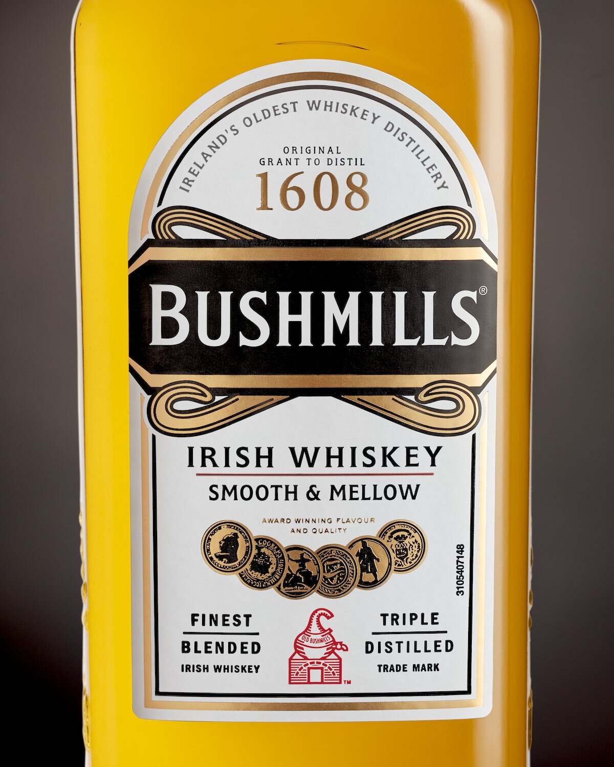
As a business that offers products for sale, you are competing against a wide range of other products, most of which are doing an amazing job at vying for your attention. Beyond competing for that attention with the brightest and shiniest imagery and advertising what does professional photography say about your company and product? Psychologically speaking? One important place to look would be your value proposition, the thing or things make you attractive to potential customers. In the case of any product that is manufactured the value proposition is that you as a brand know what you are doing and can provide a superior product. Customers know that your company might not make each product in-house, so rather than demand that you are a skilled manufacturer yourself, you must know about and have access to the best people around. If you make an age-defying moisturizer, your customer wants to be assured that the mix was concocted by the best scientists, that the raw materials were sourced from the best sources and then mixed in the best and cleanest facility and if that wasn’t enough the customer wants for you to be an expert negotiator and get great prices for all of these services that then get passed on to them. In a word, nothing short of a “superproduct”. This mix of superior quality and reasonable cost is always with us, the customer wants a product without significant compromise. No one wants substandard beef in their burger. Rather than skimp on the materials used, they want you to save costs by sourcing locally, negotiating a better price or even farming yourself. Rather than going into details about where the beef is sourced the easier approach is to ease customers concerns with branding. So it is important to give the impression that your brand is talented enough to get the best materials and labor in the world and is pumped up and excited about making your product, your superproduct. The perfect mythical product that is a result of your agency, amazing staffing, sourcing, manufacturing and negotiating. A world class brand. No compromises.

BushmillsClose.jpg

So how does your image and your branding suggest you have what it takes to offer a competitive product? The same no compromises ethos needs to be applied across all aspects of your brand. Does homegrown packaging suggest you possess the skills to create a no compromise product? Remember, you want to give the impression that you get all of the best ingredients and have access to the smartest and best people. Your packaging needs to look like it is from the same bunch of ultra-competent people. Why if you possess the skills to pool the best talent and resources would you skimp on any link in the chain, simple answer, you wouldn’t. The same is true for graphic design and photography, they need to be of excellent quality to assure a client that you are able to get the very best people onboard with your vision. If we were to simplify this argument, whether your product is the finest in the world or somewhat less fine, the impression of quality must be achieved before you even get a chance to prove yourself. When your branding is compromised the impression or illusion of competence vanishes, and when branding is impeccable mediocre products gain the sheen of a superproduct without any of its inherent qualities.

OatmealUnleashed.jpg

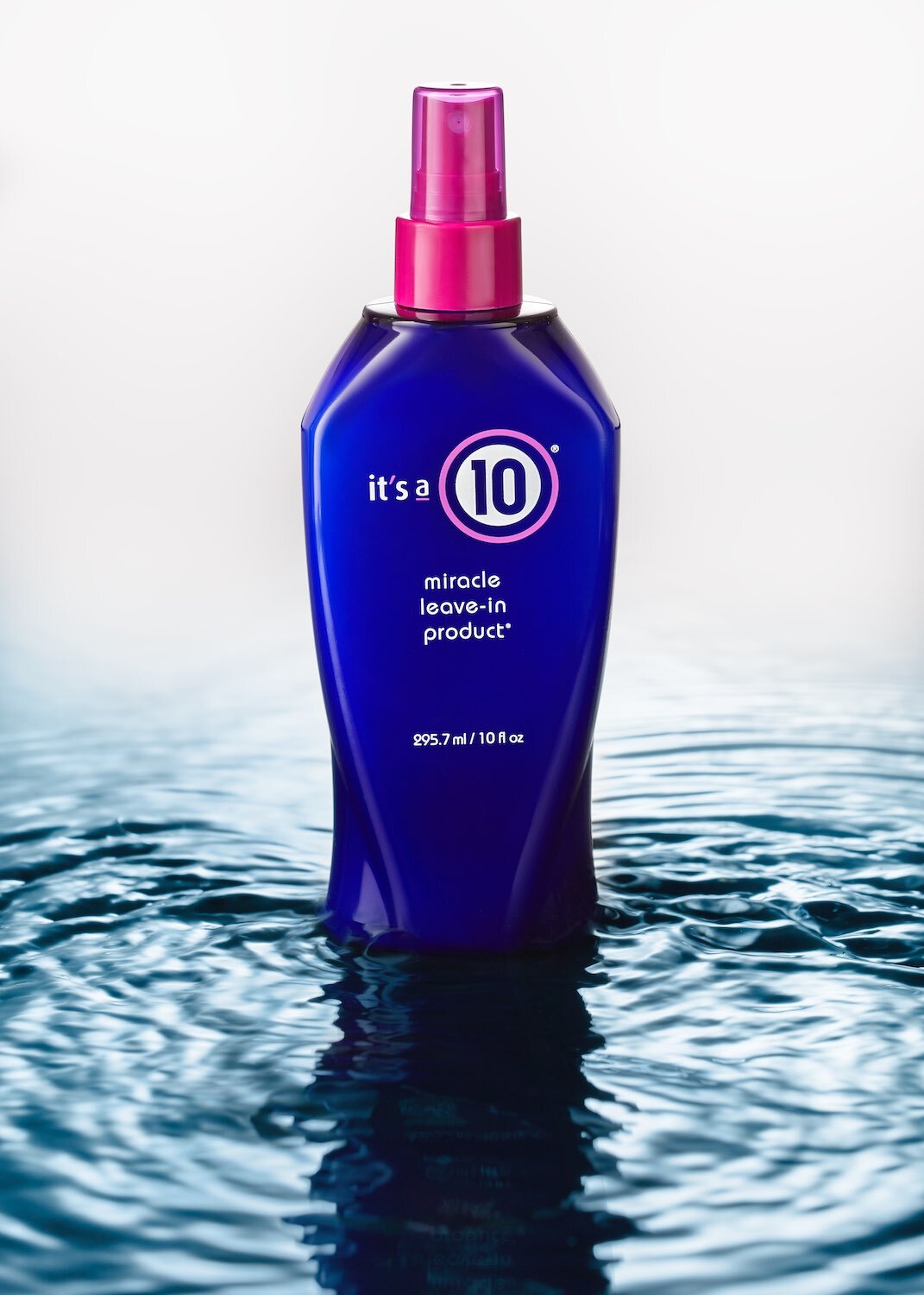
When the customer is presented with a wall of options, say, of shampoos at the grocery store. Without previous knowledge of the products, the customer is looking for clues. They might look for features but they are also looking at branding, for signs of competence and quality. What is inside doesn’t matter much for this brief moment. What really matters is that the branding fulfills your potential customer's needs and desires. Did the brand source interesting materials? Does the packaging look generic or unique, is the labelling a sticker or screen printed, paper or vinyl? All of these are earmarks of quality that go into a consumers decision to buy. Fortunately or unfortunately at this moment image matters, a lot. And if you do have a great product this is precisely the moment that matters. Unless you can overcome the hurdle of every aspect of your brand looking uncompromised, you won’t get the opportunity to prove yourself.

This is all to say, in the range of tools you have to reach out to potential customers, your image is key. Packaging, design and photography can say volumes about what you are offering. Countless products don’t "hit the shelves" at all, rather they are sold on virtual shelves. More and more this is where the decisions are made. Photography is playing a larger role because so much shopping is being done online, a trend that seems to have no end in sight. This is allowing small independent brands access to customers that wouldn’t have been possible only a few years ago. More importantly it is allowing these same small brands to compete on even terms with huge entrenched brands. The cost of entry is simply to suggest that your brand doesn’t compromise on quality, and the easiest way to give this impression is to manage your image and what it says about you…. Most importantly if you are lookingfor creative solutions in product photography for your brand you have come to the right place.

The white acrylic gesso I used, it is better than white acrylic because it is matte.

The white acrylic gesso I used, it is better than white acrylic because it is matte.

Painting Flat-Lay backdrops for Food Photography

Daniel Jackson September 27, 2021

I find that there are about a million little chores to do in a photography business. Something I have been meaning to do for a little while now is dedicate a some time to making backgrounds for my overhead food shots. You know the kind, sort of like cement or metal with lots of texture but fairly harmonies and not too distracting. I started with a roll of vinyl and some acrylic gesso in white and black. First I painted the vinyl a solid dark gray. The first coat isn’t vital, you just need to cover the vinyl. I did it with kind of a stipple with a 2” natural hair brush. Then my philosophy is to add lighter paint thinly to the dar undercoat and try and disguise the fact that you didi it with a paint brush. I get the white or light gray paint and water it down so it settles in bubbly little patches then quickly grab a sheet of paper and cover my wet paint, I rub it down and pull the paper back up. The result is a texture that feels very organic and unlike a paint brush. I finished two backdrops today. I am not sure if they are perfect but they have a lot of depth and I am inspired to use them soon.

Here is one of the backdrops with a plate for context,I think it looks a bit like an old piece of metal.

Here is one of the backdrops with a plate for context,I think it looks a bit like an old piece of metal.

Next I plan on trying some lighter and darker versions. I think it might be smart to try using different papers for blotting up the lighter paint. I have been using glassine and have also tried butchers paper but it might be interesting to try some plastic wrap because it doesn’t absorb and should have a higher contrast look.

Now to experiment and see what I can come up with. In the coming months I plan to make some wood tops and product photography backgrounds as well. I will post my process when I do. Thanks for joining me.

DotCakes-2762.jpg

Keep Your Eyes on This Space

Daniel Jackson September 23, 2021

Thanks so much for visiting, I am delighted that you have taken the time to look at my site. I have been busy updating , adding new images and streamlining the page to improve your viewing experience. So, brand new updated website, check! New awesome content on my blog, check…well give me a sec, the ink isn’t quite dry on the new site but, I have a lot of ideas that I should be adding in the coming weeks and months. I promise they are coming soon. I hope to use the blog to cover some of the questions I run into over and over, like, “What should I expect from a shoot?” and “What is a lifestyle shot, or an e-commerce shot?”. Product and food photography can be time consuming work so I hope to explain what to look for and what different levels of lighting and effort look like a subject I briefly touched on here in What Does a Photograph Cost?. A finely crafted image can take from minutes to a whole day to shoot, I hope to be able to explain why the product itself can dictate how you might want to light and shoot, but equally important is Where will the image be viewed and even how to get the most from your photo purchase. So stick tight, and keep your eyes on this spot. I hope to see you again soon right here! -Dan

Search Posts


Featured Posts

Featured
Intradas03web.jpg
Apr 2, 2025
A Smooth Day of On Location Product Photography
Apr 2, 2025
Apr 2, 2025
Fragrancebundle1.jpg
Mar 31, 2023
A Great Partnership
Mar 31, 2023
Mar 31, 2023
Surfacessm.jpg
Jan 24, 2023
My Background and surface collection for product and food photography
Jan 24, 2023
Jan 24, 2023
burgertimeLogoweb.jpg
Jan 28, 2022
Product Photography Assets - How to Make the Most of Them
Jan 28, 2022
Jan 28, 2022
Blueweb.jpg
Jan 22, 2022
DIY Product Photography Background Sets
Jan 22, 2022
Jan 22, 2022
Creative11.jpg
Oct 17, 2021
Arca Swiss Cube C1 vs Core 75
Oct 17, 2021
Oct 17, 2021
BeeHarmony.jpg
Sep 30, 2021
Product photography 101: What your branding says about you
Sep 30, 2021
Sep 30, 2021
tempImageGKnUdp.gif
Sep 27, 2021
Painting Flat-Lay backdrops for Food Photography
Sep 27, 2021
Sep 27, 2021
DotCakes-2762.jpg
Sep 23, 2021
Keep Your Eyes on This Space
Sep 23, 2021
Sep 23, 2021